Overview
A WordPress Agency Website That Stands Out Without Making Visitors Work for It
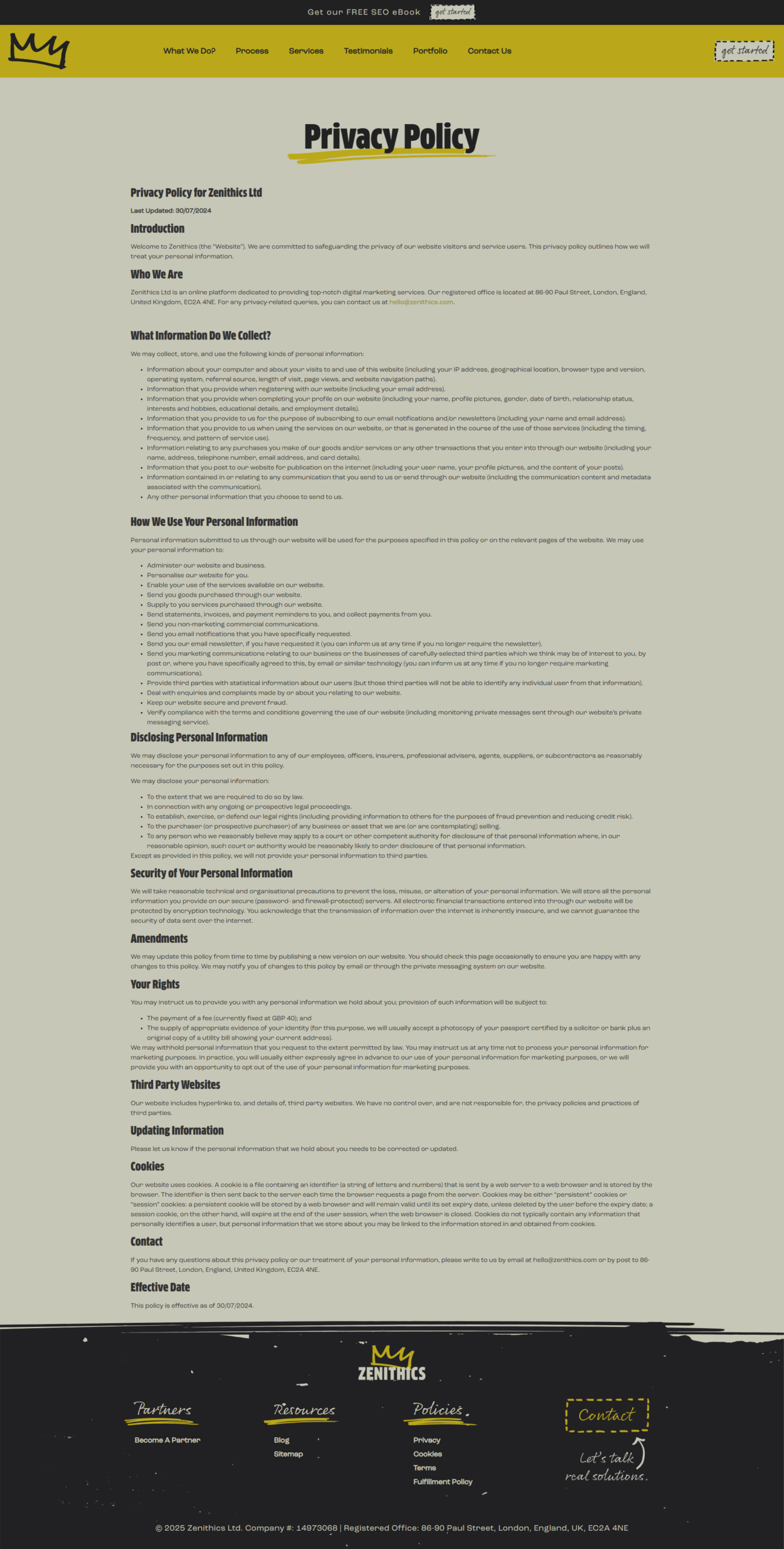
Most agency websites promise to make their clients stand out. Zenithics wanted its own site to show what that looks like. I designed a responsive WordPress website that brings the agency’s irreverent personality to life with hand-drawn crowns, crossed-out marketing clichés and bold mustard-and-charcoal layouts. The visual style gets people’s attention, while the structure helps them find the work, understand the services and decide how to get in touch.
The Challenge
Keeping an Unconventional Brand Easy to Navigate
The site had to work for more than one audience. A business owner might want to see past projects before discussing a budget. Another agency might be looking for a white-label partner. Someone arriving through a blog post might simply want practical SEO advice. The challenge was to give each visitor a useful next step without flattening the brand into a conventional agency template or pushing everyone towards the same contact form.
The Solution
From First Impression to the Right Enquiry
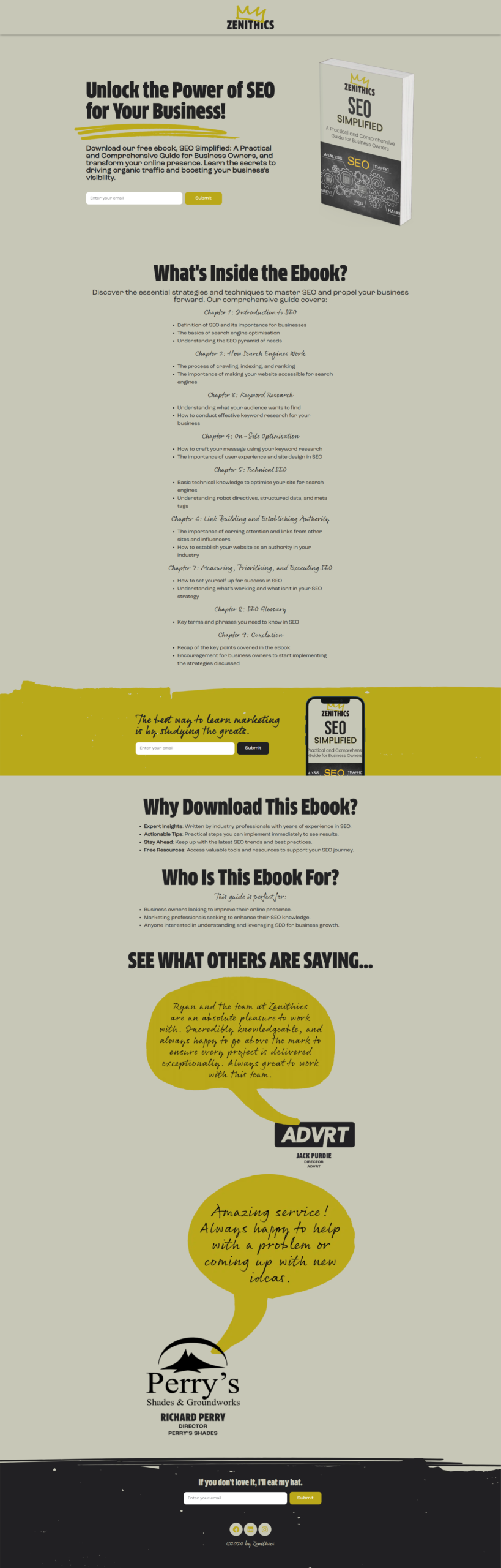
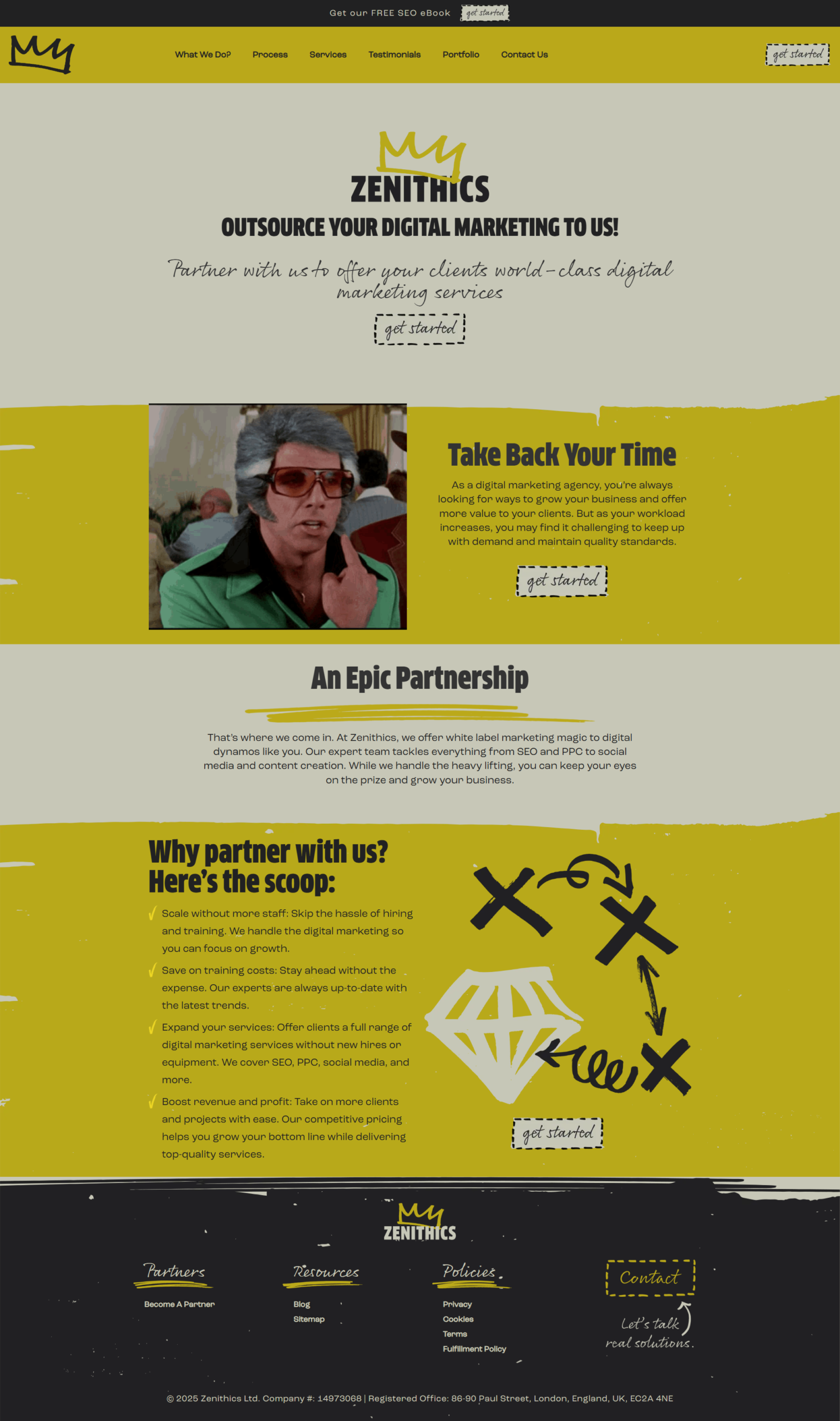
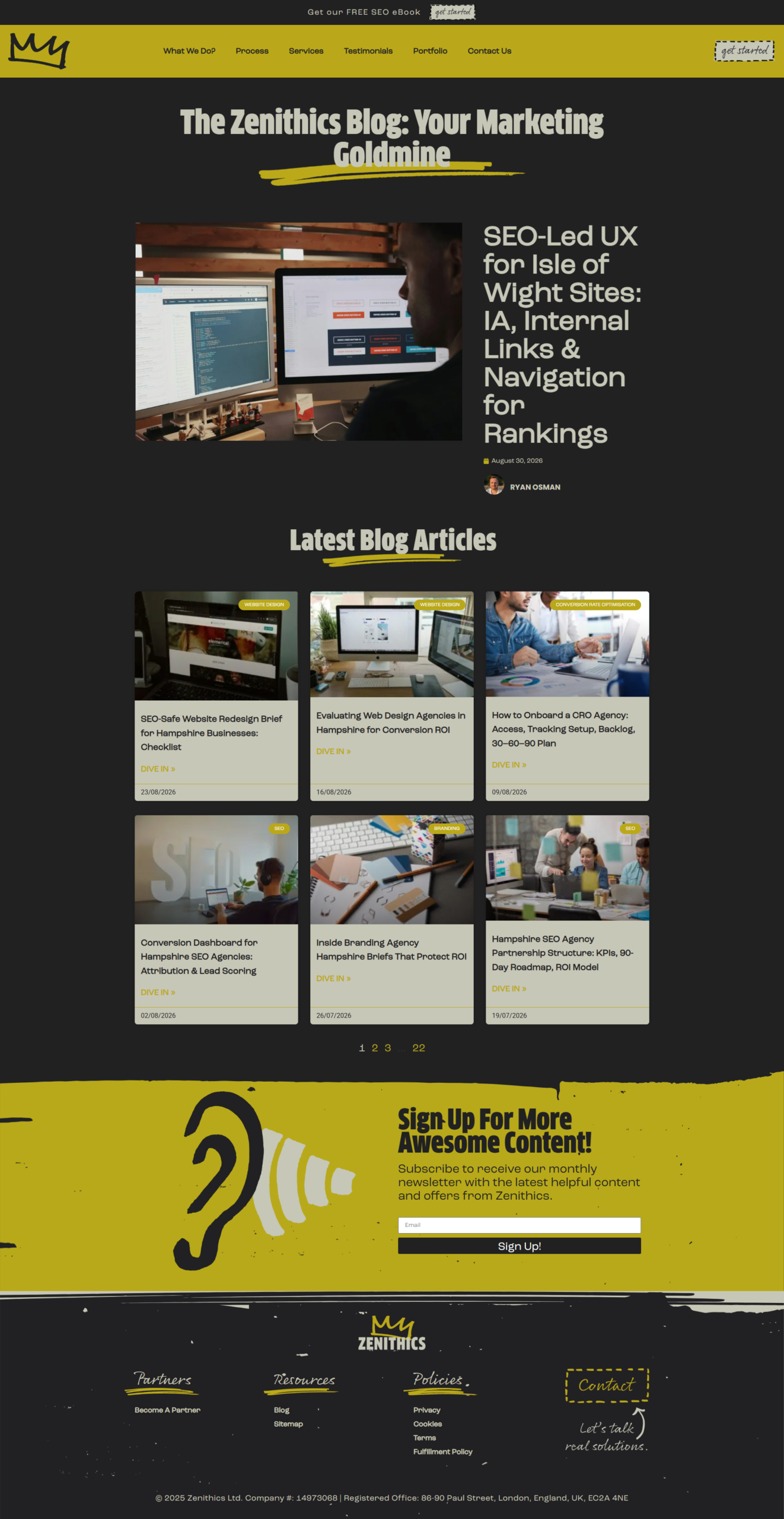
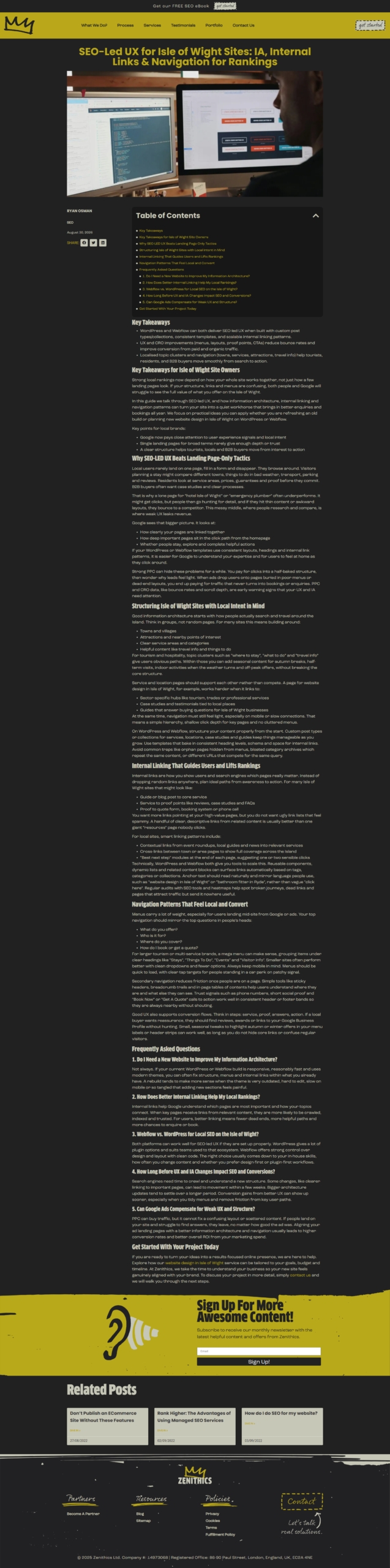
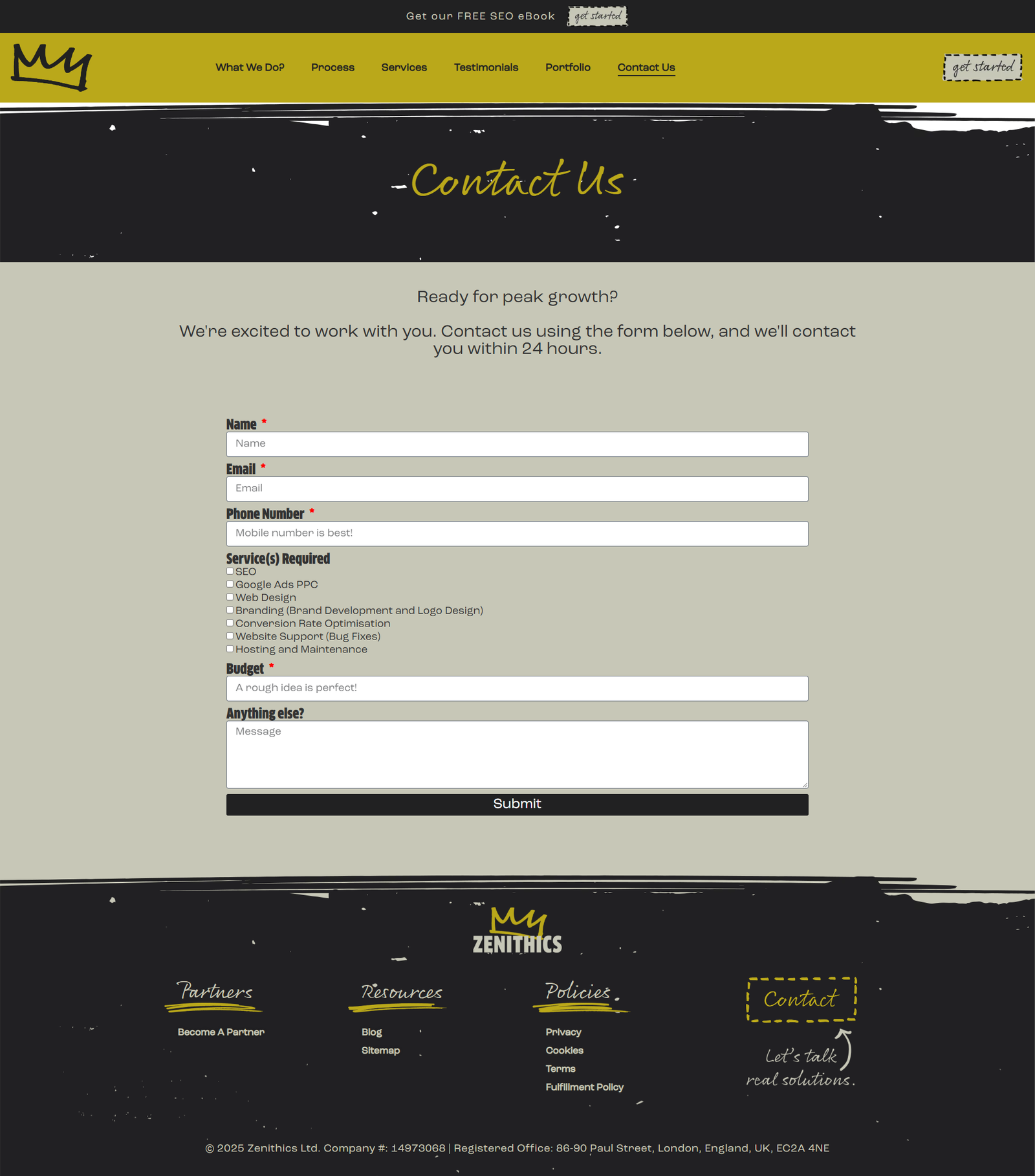
I organised the homepage around the agency’s four-step process, then paired its service list with client testimonials and a browsable showcase of past projects. I carried the visual identity into the blog archive and article layouts, using a table of contents to make longer guides easier to scan. The free SEO eBook got its own sign-up page, and white-label prospects got a dedicated partnership page. For visitors ready to talk about a project, the enquiry form asks which services they need and what budget they have in mind, giving the agency a more useful starting point than a blank message box.